Calendar Flowers: A Blooming Lens on Climate Extremes
In a world grappling with increasingly frequent climate extremes, finding new ways to make environmental data both accessible and meaningful is essential. One such innovation is the Calendar Flower — a visually striking and conceptually rich approach to representing complex patterns of droughts and floods over space and time.
A Visual Metaphor that Speaks Volumes
At first glance, flowers may not seem like the natural choice for representing environmental stress. But that’s precisely why they work. Inspired by petals and tree rings, Calendar Flowers challenge our expectations by using beauty and softness to visualise disruption and change.
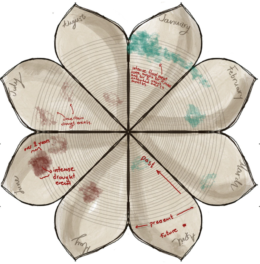
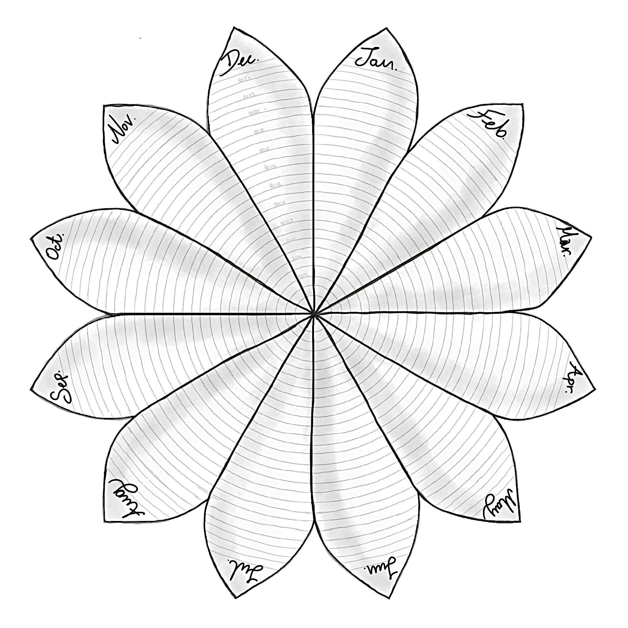
Each flower represents a specific geographic region. The 12 petals correspond to months of the year, while the rings within each petal trace climate events across years — with the innermost rings representing the past and the outermost, the present. The colour system transforms each petal into a map of extremes: brown for drought, blue for flood, orange/red for drought-to-flood transitions.
This approach was first sketched in analogue form and later brought to life using D3.js and interactive maps. When a user clicks on a flower bud (colour-coded by event intensity), it blooms into a full Calendar Flower, revealing the climate history of that location — an elegant fusion of art and data.
From Data Overload to Meaningful Simplicity
Environmental data is massive and messy. The Calendar Flower simplifies this through aggregation and abstraction, yet maintains the richness of insight. By organising data along spatial and temporal lines, the Calendar Flower acts as a spatiotemporal interface, helping users intuitively grasp patterns like:
How long has the drought lasted
When and where a flood followed
The seasonality of extreme events across decades
Designing for Uncertainty
Perhaps most powerfully, the Calendar Flower doesn’t just show what we know — it leaves room for what we don’t. Uncertainty is embedded into the design: blurred edges, opacity changes, and symbolic overlaps hint at the imperfect and evolving nature of environmental data. Rather than hiding gaps in knowledge, Calendar Flowers embraces them, visually prompting critical inquiry rather than passive consumption.
A Growing Future
Originally part of the PerfectStorm project, the Calendar Flower concept has already shown its potential through early case studies in Australia and Canada. Moving forward, there are plans to scale this globally, add socioeconomic layers (like hazard impact and response), and turn the current storymap into a full interactive platform.
Ultimately, Calendar Flowers are more than data visuals. They are narrative tools that help make sense of climate chaos through clarity, colour, and care.
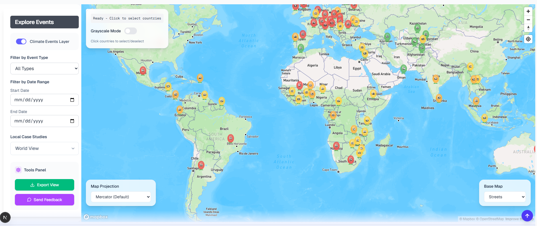
Draft of the interactive Drought-2-Flood interactive map